When it comes to web design, images are vital. Paragraph after paragraph of content and no graphics or photos to break it up looks incredibly boring. However, there are a few behind-the-scenes CSS tricks you can employ to help your images stand out from the crowd. Ranging from that-looks-cool to downright-practical, these six CSS tricks should be in every developer’s playbook.
Think outside the box
Move beyond the world of plain boxy images with the 3 B’s — box-shadow, borders and border-radius.
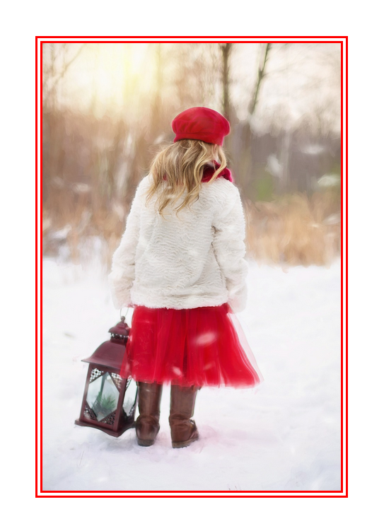
Use the box-shadow property to add a soft drop-shadow effect to an image or graphic button.


1
2
3
|
img {
box-shadow: 8px 8px 10px #aaa;
}
|
The first two numbers specify the horizontal and vertical shadow positions, respectively. The third number sets the blur (higher numbers = fuzzier). Not used in our example is an optional fourth value that specifies the spread (size) of the shadow. The final value allows you to set the color of your shadow effect.
Pro tip: Shadows should be subtle and used to accentuate graphics or images. Don’t go too overboard or you’ll instead make it more difficult for visitors to look at your site.
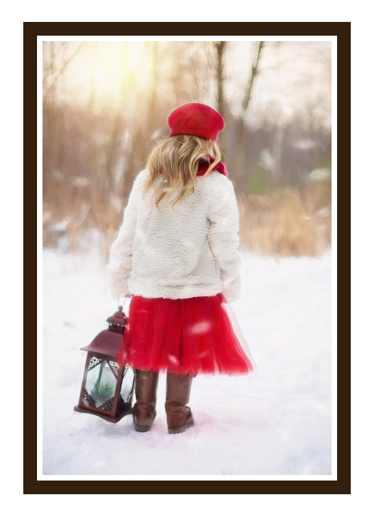
If you want to set an image apart but a shadow isn’t quite the right effect, consider a border. While borders are typically thought of as solid lines of a set thickness, CSS actually offers quite a few other options.
1
2
3
|
img {
border: 10px double red;
}
|
First, we specify the thickness of the border. The second property defines the type of border; this can be solid, or it could be dashed, dotted, double, groove, ridge, inset or outset. The best way to see the differences is simply to experiment with various values. In this case, we get a double red border around the image:
To take it further, you can use border in conjunction with padding to create a framed effect. If we use a setting of
1
2
3
4
|
Img {
border: 15px solid #3e2b14;
padding: 10px;
}
|
… you see a “frame” around our photo:
If you really want to break away from the boxed-look, then theborder-radius property is for you. With this setting, you can create everything from slightly-rounded corners to full-on circular images with nothing but CSS.
This property can take values in a number of different ways, so it’s best to check out the this tutorial for more information. In our example, the corners are all set to the same value with a single number. The first image shows slightly rounded corners, while the second shows a full-round, or circular, image.
1
2
3
4
5
6
7
|
img {
border-radius: 30px; // partially rounded corners
}
img {
border-radius: 100%; // full circular image
}
|


Things aren’t always what they seem
Perhaps you want to show an image but have it “fade” more into the background. In this instance, the opacity setting can be useful. The first is the image as-is; in the second, the image is set at half opacity (0.5). Opacity values range from 0-1, with 1 being “full strength.”
1
2
3
|
img {
opacity: 0.5;
}
|
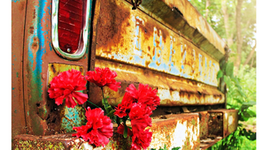

With a little extra preparation in your code, you can achieve a variety of additional visual tricks. In this example, we’ve set the image as the background to a <div> element instead of a simple <img> tag. Now, a linear-gradient can be applied to the element to create some neat effects.
Here is the base CSS for the source <div>:
1
2
3
4
|
.imageDiv {
background: url(“images/rust.png”);
height: 700px;
}
|
Typically in a linear gradient, two different colors are specified to create a fade effect. But if you use the same color in both places, you can create a photo-filter effect. You could darken the image…
1
2
3
4
5
6
7
8
|
.imageDiv {
background-image:
linear-gradient(
rgba(0, 0, 0, 0.5),
rgba(0, 0, 0, 0.5)
),
background: url(“images/rust.png”);
}
|
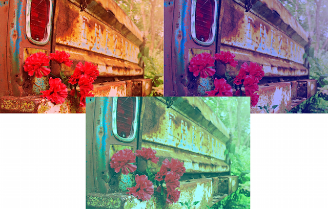
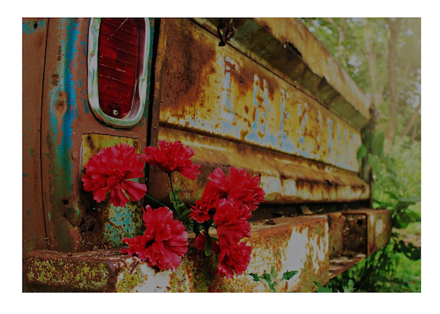 …or create a color wash effect.
1
2
3
4
5
6
7
8
|
.imageDiv {
background-image:
linear-gradient(
rgba(255, 0, 0, 0.5),
rgba(255, 0, 0, 0.5)
),
background: url(“images/rust.png”);
}
|
Hiç yorum yok:
Yorum Gönder